
Evidence of Good Websites
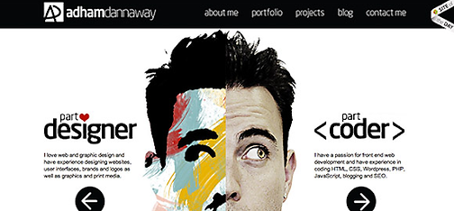
This is a good website as it’s clear and has multiple, good colour schemes. I also like the layout for the website as it stands out. It has plenty of images and the menu is interesting as it has text and images not just text.

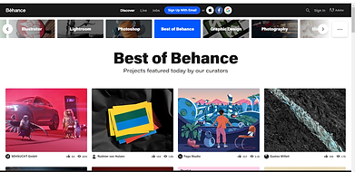
This is a good website as it has a clear and visible dropdown menu and the colours contrast with one another. This website has easy access to anything you would want to see on the website.
This is a good website as it’s nice and simple, not over complicated and just stands out with the colours and text (fonts).
Evidence of BAD Websites
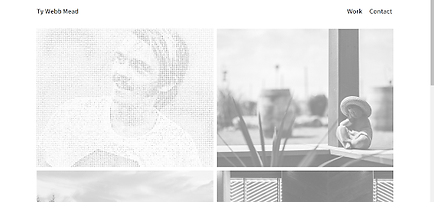
I don’t like this website as it’s just full of pictures and has no text about him at all. It’s too plain and dull as it has no colour.

I don’t like this website as the colours of the top blend too much with the background and the text is too small to read and should stand out. It has no other features like a dropdown menu so therefore it makes it quite plain

I don't like this portfolio as it had too much text on the website and only has 1 image not multiple. There should be more creativity put towards this as it looks boring and dull like a CV.